Web editors: 5 reasons to love standfirsts
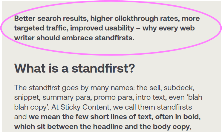
Better search results, higher clickthrough rates, more targeted traffic, improved usability – why every web writer should embrace standfirsts.
What is a standfirst?
The standfirst goes by many names: the sell, subdeck, snippet, summary para, promo para, intro text, even ‘blah blah copy’. At Sticky Content, we call them standfirsts and we mean the few short lines of text, often in bold, which sit between the headline and the body copy, acting as a bridge between the two. Often coded as an H2, a good standfirst expands on the headline, gives users a fuller idea of the piece to come, and hooks them into reading more. Online, these signposting paras are often completely overlooked and yet they are surprisingly important. Below (and above) is an example.

5 reasons why standfirsts are important
1. Standfirsts are often what a search engine displays
If you don’t supply meta descriptions – and if you write them properly, standfirsts make great meta descriptions – then what will Google use as the two lines of text it inserts beneath your title tag on its results page? The usual answer is that it’s the couple of lines of text surrounding the key search terms on a page. If you write them properly, they are likely to be your meta description. So there are powerful SEO tool.
2. Standfirsts make people want to click on your content
If your standfirst is picked up as an organic search snippet, it will be read by users thinking about which item in a list of search results to click on. If it’s written to be engaging, on-brand and informative, it’s likely to increase your clickthrough rate, or at least to raise the quality/targeted nature of your traffic.
3. Standfirsts save you time by doubling up as promo paras, links and meta descripts
A headline and a standfirst should be written together as a single self-contained unit of meaning. They shouldn’t overlap too much, still less repeat each other (a terrible waste of crucial space). They can then be easily be lifted out and dropped elsewhere on your site, or on affiliate sites, as a teaser to promote a piece of content. Or as the anchor text for the link back to that content, or both. They can also be used as meta descriptions. All great ways to save yourself from the kind of constant rewriting of those ‘almost the same but not quite the same’ promotional lines of text, which decrease the usability and accessibility of so many sites.
4. Standfirsts make copy more usable
The intro text serves the same purpose for an interior page as the homepage does for the entire site and the tagline does for the homepage… people need to know what they are getting into before they dive in…. A brief introduction can help users better understand the rest of the page. (Jakob Nielsen)
5. Standfirsts are how we’re used to reading (and they make us read more)
Newspapers and magazines have presented content using the head + standfirst approach for decades. A headline on its own can rarely summarise a page adequately; we’re instinctively used to scanning the two together to get a full sense of the gist of an article. It’s a powerful convention. And as print shows us again and again, a standfirst should never be a dry comprehensive summary or some generic feelgood filler copy. It should be targeted and focused, it should tease, sell, engage you to read on, throw out a question, make a promise, threat or opportunity that the body copy below goes on to answer. Then all you have to do is to write great, web friendly copy which doesn’t dash the reader’s hopes. Over to you…
[This post originally appeared on e-consultancy. Want to learn more about headlines, standfirsts and how to use them to help your readers? Sticky Content runs regular writing effective digital content training courses.]

Sean Coyte
Lead Editor


